Online Safety Network
A refresh on an established platform to help increase
awareness about the Online Safety Bill.
Strategy
Design
My Role
Design Lead
The Problem
While the UK’s Online Safety Act gained legal momentum, the OSA Network’s digital platform remained an informal community resource.
Lacking visual gravity and a sophisticated user experience, the platform struggled to bridge the gap between high level public explainers and deep dive technical evidence, creating a significant barrier to authoritative stakeholder engagement.
Contributions
Lead Designer - Prototyping - Interaction Design - Stakeholder Alignment - Dev Collaboration
Platforms
Web
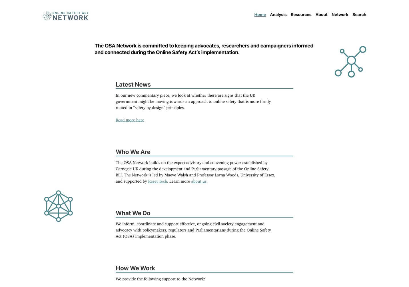
Overview
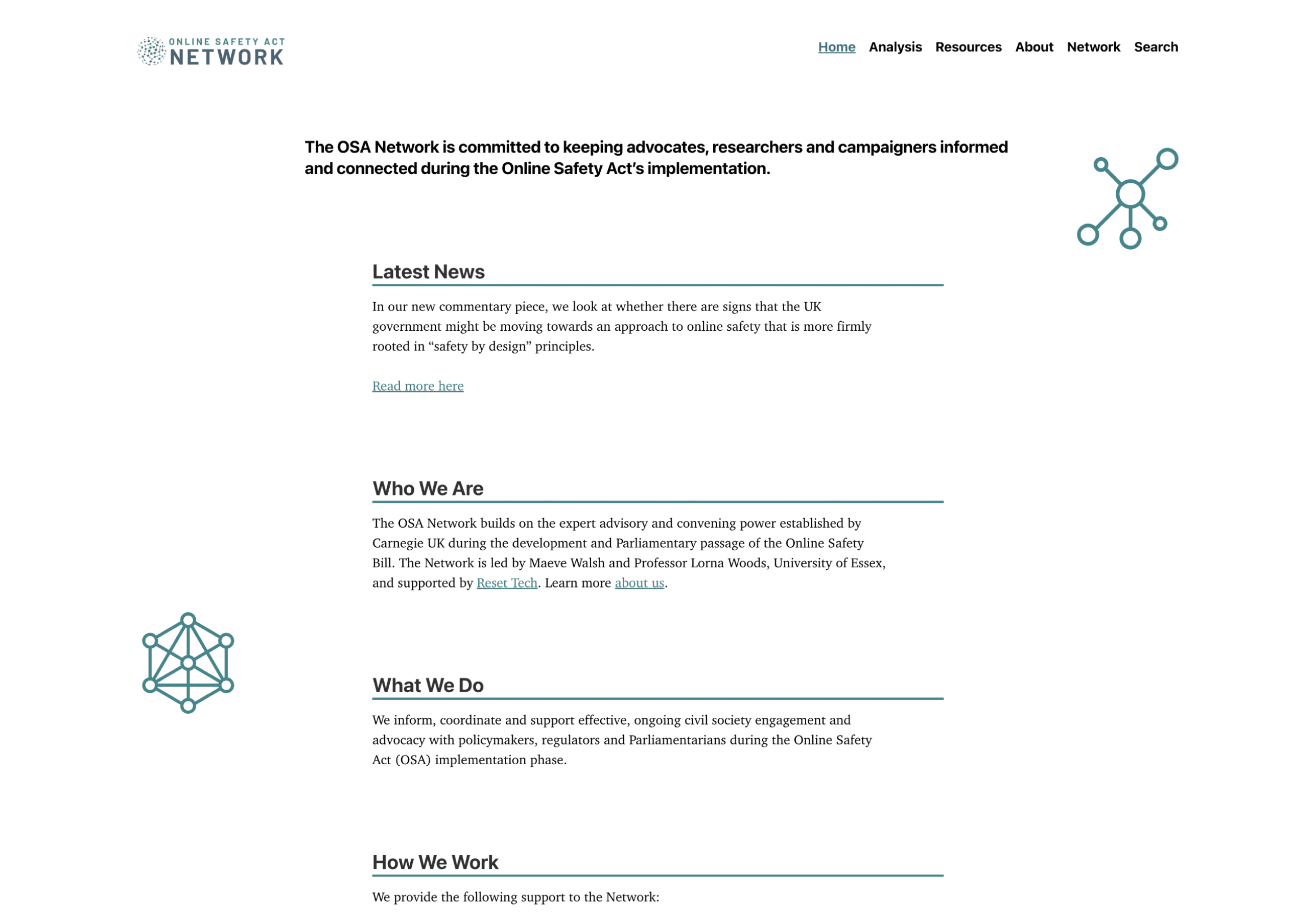
The Online Safety Act (OSA) Network is a specialized professional platform with its primary mission is to provide a centralized resource for the network of advocates, researchers, and campaigners working to ensure the effective implementation of the UK’s Online Safety Act.
As the Lead designer, the team and myself set out to completely overhaul of the digital experience of the (OSA) Network platform transitioning from an informal resource to a high authority "pillar" of the tech policy community. The platform serves as a repository for expert commentary, technical consultation responses, and evidence of harmful digital design.
Previous Interface
Solution
By implementing a modular card architecture and strategic typography, the team and I transformed dense legal data into an accessible, institutional grade resource that bridges the gap between public advocacy and technical research.

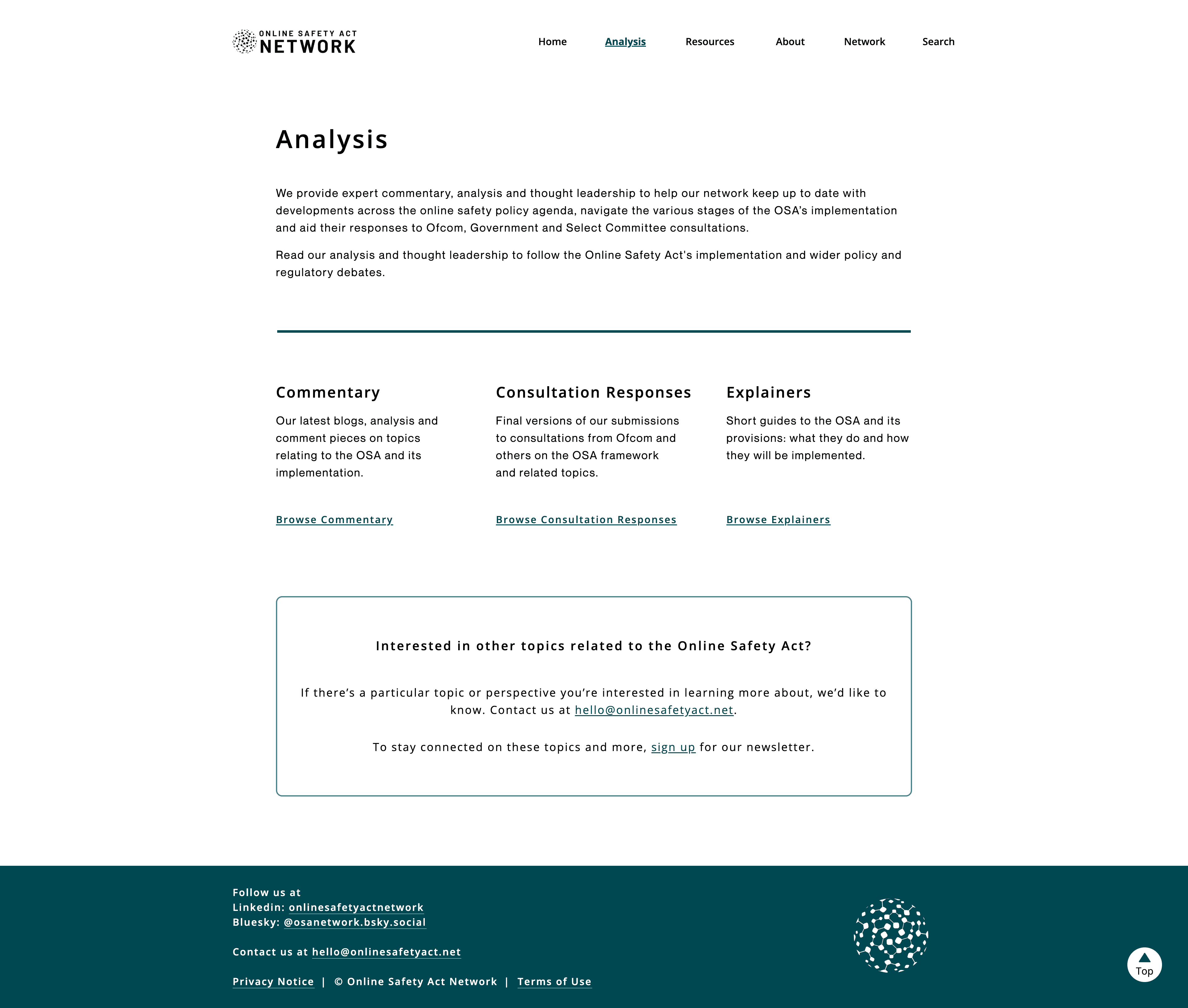
Analysis page
A clean, three column grid layout, prioritizing high level scannability for policy stakeholders. A "policy first" design employs a minimalist aesthetic with a clear typographic hierarchy and horizontal rules to separate broad context from browsable expert repositories.
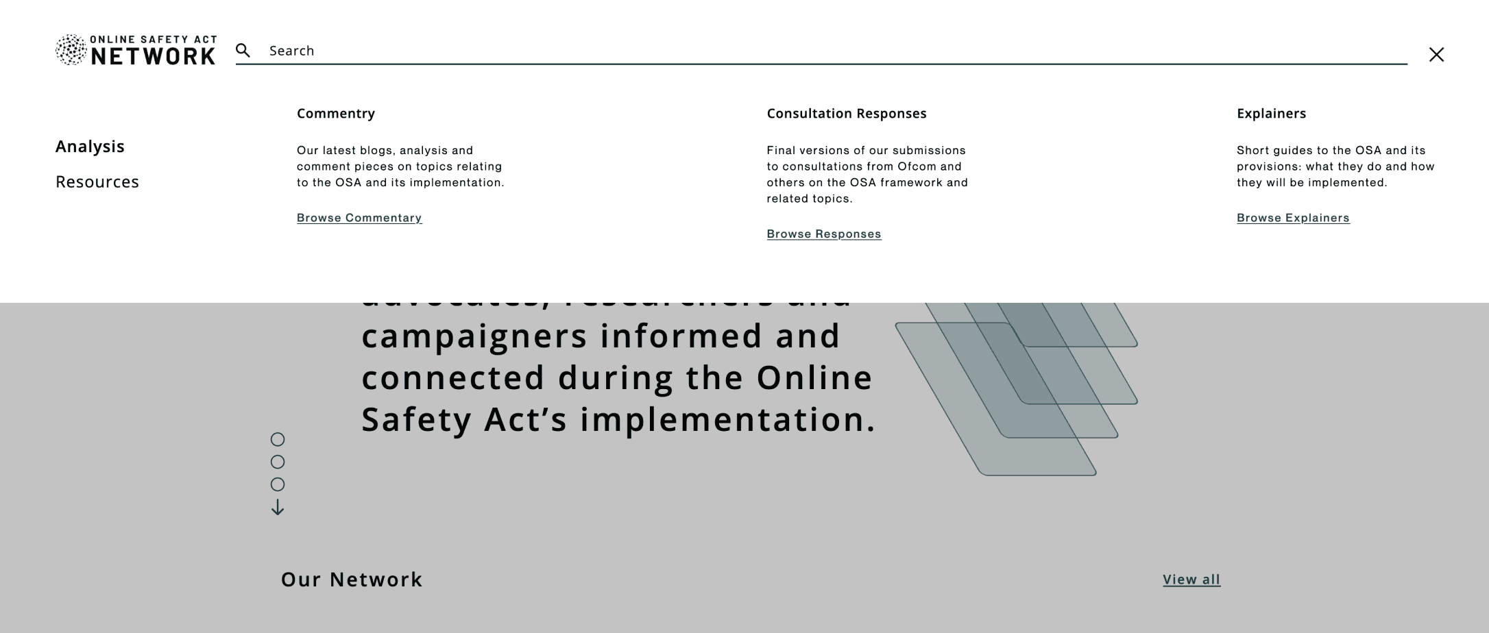
Search function
This mega menu integrates a clean sidebar and a prominent top level search bar, maintaining the platform's authoritative aesthetic while providing immediate access to expert repositories.

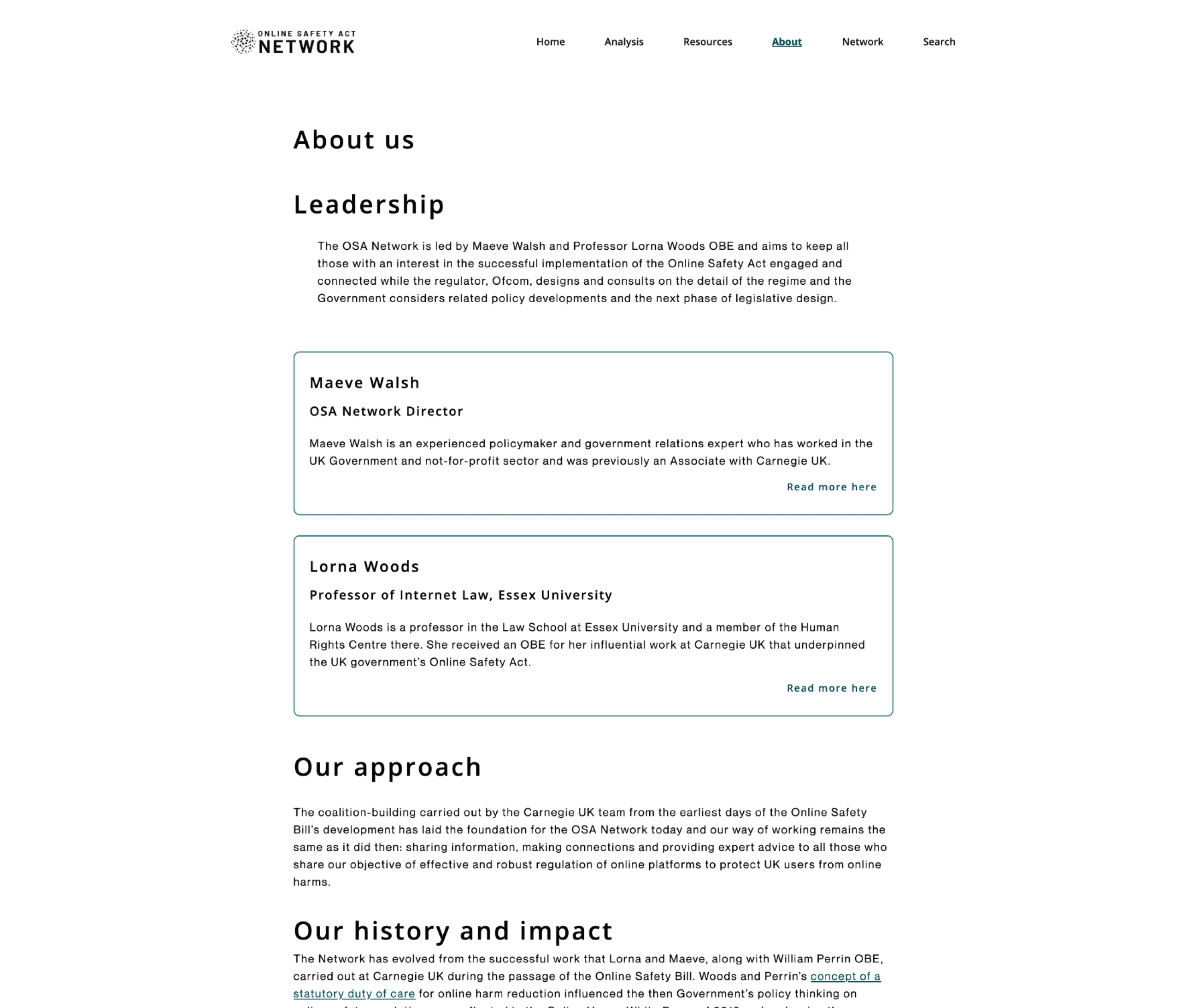
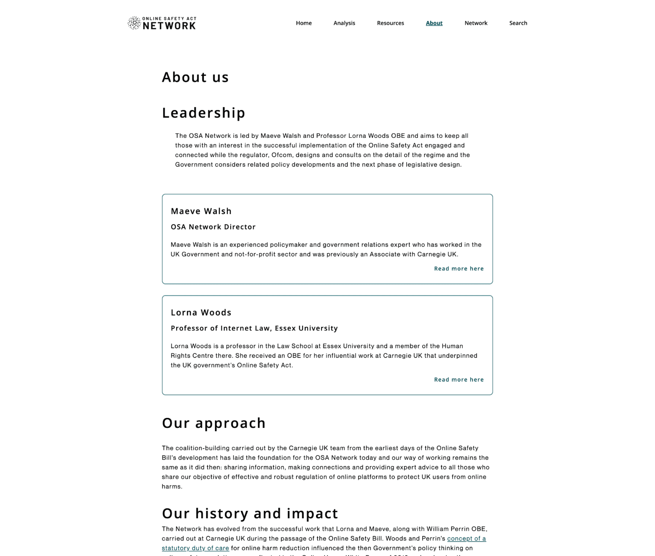
About us
This page employs a clean, single column layout featuring a strong typographic hierarchy and minimalist, card based containers to highlight leadership and institutional history.
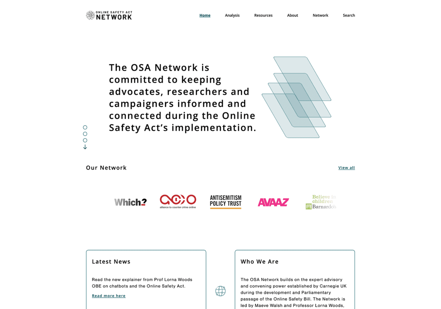
Branding + Visual Strategy
The brand strategy centers on a 'Network' motif, transitioning the platform from a silent repository to an active, institutional resource. This visual language leverages structural line work and translucent layering to visualize the 'blueprint' of the Online Safety Act. Custom iconography and a cohesive partner grid work in tandem to establish the OSA Network as a high-authority, unified hub for researchers and campaigners
Typography System
I selected Neue Montreal for its modern neutrality and legibility in data dense environments. By using varied weights to anchor Deal IDs against secondary metadata, I established a hierarchy that minimizes cognitive fatigue and makes complex tracking unmistakable and highly scannable.
Open Sans
Neue Montreal
Color Choices
Replacing generic corporate aesthetics with a professional suite of greens, the color strategy conveys stability and intelligence through a monochromatic family that prevents "attention fatigue". OSA Dark Green anchors the primary navigation to evoke the permanence of a legal body, while structural mid tones like OSA Green are reserved for iconography and secondary elements to ensure a sophisticated, expert driven identity.
Conclusion
The redesign successfully established the OSA Network as a definitive, high authority pillar for the tech policy community. By expanding research capacity and centralizing expert leadership, the platform now serves as a critical catalyst for the implementation of the Online Safety Act and a strategic powerhouse for civil society campaigns.
Online Safety Network
A refresh on an established platform to help increase
awareness about the Online Safety Bill.
Strategy
Design
My Role
Design Lead
The Problem
While the UK’s Online Safety Act gained legal momentum, the OSA Network’s digital platform remained an informal community resource.
Lacking visual gravity and a sophisticated user experience, the platform struggled to bridge the gap between high level public explainers and deep dive technical evidence, creating a significant barrier to authoritative stakeholder engagement.
Contributions
Lead Designer - Prototyping - Interaction Design - Stakeholder Alignment - Dev Collaboration
Platforms
Web
Overview
The Online Safety Act (OSA) Network is a specialized professional platform with its primary mission is to provide a centralized resource for the network of advocates, researchers, and campaigners working to ensure the effective implementation of the UK’s Online Safety Act.
As the Lead designer, the team and myself set out to completely overhaul of the digital experience of the (OSA) Network platform transitioning from an informal resource to a high authority "pillar" of the tech policy community. The platform serves as a repository for expert commentary, technical consultation responses, and evidence of harmful digital design.
Previous Interface
Solution
By implementing a modular card architecture and strategic typography, the team and I transformed dense legal data into an accessible, institutional grade resource that bridges the gap between public advocacy and technical research.
Analysis page
A clean, three column grid layout, prioritizing high level scannability for policy stakeholders. A "policy first" design employs a minimalist aesthetic with a clear typographic hierarchy and horizontal rules to separate broad context from browsable expert repositories.
Search function
This mega menu integrates a clean sidebar and a prominent top level search bar, maintaining the platform's authoritative aesthetic while providing immediate access to expert repositories.
About us
This page employs a clean, single column layout featuring a strong typographic hierarchy and minimalist, card based containers to highlight leadership and institutional history.
Branding + Visual Strategy
The brand strategy centers on a 'Network' motif, transitioning the platform from a silent repository to an active, institutional resource. This visual language leverages structural line work and translucent layering to visualize the 'blueprint' of the Online Safety Act. Custom iconography and a cohesive partner grid work in tandem to establish the OSA Network as a high-authority, unified hub for researchers and campaigners
Typography System
I selected Neue Montreal for its modern neutrality and legibility in data dense environments. By using varied weights to anchor Deal IDs against secondary metadata, I established a hierarchy that minimizes cognitive fatigue and makes complex tracking unmistakable and highly scannable.
Open Sans
Neue Montreal
Color Choices
Replacing generic corporate aesthetics with a professional suite of greens, the color strategy conveys stability and intelligence through a monochromatic family that prevents "attention fatigue". OSA Dark Green anchors the primary navigation to evoke the permanence of a legal body, while structural mid tones like OSA Green are reserved for iconography and secondary elements to ensure a sophisticated, expert driven identity.
Conclusion
The redesign successfully established the OSA Network as a definitive, high authority pillar for the tech policy community. By expanding research capacity and centralizing expert leadership, the platform now serves as a critical catalyst for the implementation of the Online Safety Act and a strategic powerhouse for civil society campaigns.
Online Safety Network
A refresh on an established platform to help increase
awareness about the Online Safety Bill.
Strategy
Design
My Role
Design Lead
The Problem
While the UK’s Online Safety Act gained legal momentum, the OSA Network’s digital platform remained an informal community resource.
Lacking visual gravity and a sophisticated user experience, the platform struggled to bridge the gap between high level public explainers and deep dive technical evidence, creating a significant barrier to authoritative stakeholder engagement.
Contributions
Lead Designer - Prototyping - Interaction Design - Stakeholder Alignment - Dev Collaboration
Platforms
Web
Overview
The Online Safety Act (OSA) Network is a specialized professional platform with its primary mission is to provide a centralized resource for the network of advocates, researchers, and campaigners working to ensure the effective implementation of the UK’s Online Safety Act.
As the Lead designer, the team and myself set out to completely overhaul of the digital experience of the (OSA) Network platform transitioning from an informal resource to a high authority "pillar" of the tech policy community. The platform serves as a repository for expert commentary, technical consultation responses, and evidence of harmful digital design.
Previous Interface

Solution
By implementing a modular card architecture and strategic typography, the team and I transformed dense legal data into an accessible, institutional grade resource that bridges the gap between public advocacy and technical research.

Analysis page
A clean, three column grid layout, prioritizing high level scannability for policy stakeholders. A "policy first" design employs a minimalist aesthetic with a clear typographic hierarchy and horizontal rules to separate broad context from browsable expert repositories.
Search function
This mega menu integrates a clean sidebar and a prominent top level search bar, maintaining the platform's authoritative aesthetic while providing immediate access to expert repositories.
About us
This page employs a clean, single column layout featuring a strong typographic hierarchy and minimalist, card based containers to highlight leadership and institutional history.
Branding + Visual Strategy
The brand strategy centers on a 'Network' motif, transitioning the platform from a silent repository to an active, institutional resource. This visual language leverages structural line work and translucent layering to visualize the 'blueprint' of the Online Safety Act. Custom iconography and a cohesive partner grid work in tandem to establish the OSA Network as a high authority, unified hub for researchers and campaigners
Typography System
I selected Neue Montreal for its modern neutrality and legibility in data dense environments. By using varied weights to anchor Deal IDs against secondary metadata, I established a hierarchy that minimizes cognitive fatigue and makes complex tracking unmistakable and highly scannable.
Open Sans
Neue Montreal
Color Choices
Replacing generic corporate aesthetics with a professional suite of greens, the color strategy conveys stability and intelligence through a monochromatic family that prevents "attention fatigue". OSA Dark Green anchors the primary navigation to evoke the permanence of a legal body, while structural mid-tones like OSA Green are reserved for iconography and secondary elements to ensure a sophisticated, expert driven identity.
Conclusion
The redesign successfully established the OSA Network as a definitive, high authority pillar for the tech policy community. By expanding research capacity and centralizing expert leadership, the platform now serves as a critical catalyst for the implementation of the Online Safety Act and a strategic powerhouse for civil society campaigns.
Online Safety Network
Strategy
Design
A refresh on an established platform to help increase
awareness about the Online Safety Bill.
My Role
Design Lead
The Problem
While the UK’s Online Safety Act gained legal momentum, the OSA Network’s digital platform remained an informal community resource.
Lacking visual gravity and a sophisticated user experience, the platform struggled to bridge the gap between high level public explainers and deep-dive technical evidence, creating a significant barrier to authoritative stakeholder engagement.
Contributions
Lead Designer - Prototyping - Interaction Design - Stakeholder Alignment - Dev Collaboration
Platforms
Desktop Web
Overview
The Online Safety Act (OSA) Network is a specialized professional platform with its primary mission is to provide a centralized resource for the network of advocates, researchers, and campaigners working to ensure the effective implementation of the UK’s Online Safety Act.
As the Lead designer, the team and myself set out to completely overhaul of the digital experience of the (OSA) Network platform transitioning from an informal resource to a high authority "pillar" of the tech policy community. The platform serves as a repository for expert commentary, technical consultation responses, and evidence of harmful digital design.
Previous Interface
Solution
By implementing a modular card architecture and strategic typography, the team and I transformed dense legal data into an accessible, institutional grade resource that bridges the gap between public advocacy and technical research.
Analysis page
A clean, three-column grid layout, prioritizing high-level scannability for policy stakeholders. A "policy first" design employs a minimalist aesthetic with a clear typographic hierarchy and horizontal rules to separate broad context from browsable expert repositories.
Search function
This mega menu integrates a clean sidebar and a prominent top level search bar, maintaining the platform's authoritative aesthetic while providing immediate access to expert repositories.

About us
This page employs a clean, single column layout featuring a strong typographic hierarchy and minimalist, card based containers to highlight leadership and institutional history.

Branding + Visual Strategy
The brand strategy centers on a 'Network' motif, transitioning the platform from a silent repository to an active, institutional resource. This visual language leverages structural line work and translucent layering to visualize the 'blueprint' of the Online Safety Act. Custom iconography and a cohesive partner grid work in tandem to establish the OSA Network as a high authority, unified hub for researchers and campaigners
Typography System
I selected Neue Montreal for its modern neutrality and legibility in data dense environments. By using varied weights to anchor Deal IDs against secondary metadata, I established a hierarchy that minimizes cognitive fatigue and makes complex tracking unmistakable and highly scannable.
Open Sans
Neue Montreal
Color Choices
Replacing generic corporate aesthetics with a professional suite of greens, the color strategy conveys stability and intelligence through a monochromatic family that prevents "attention fatigue". OSA Dark Green anchors the primary navigation to evoke the permanence of a legal body, while structural mid-tones like OSA Green are reserved for iconography and secondary elements to ensure a sophisticated, expert driven identity.
Conclusion
The redesign successfully established the OSA Network as a definitive, high authority pillar for the tech policy community. By expanding research capacity and centralizing expert leadership, the platform now serves as a critical catalyst for the implementation of the Online Safety Act and a strategic powerhouse for civil society campaigns.